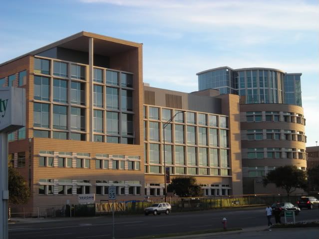
Now, on to the topic of the day - fabulous cities all over the world- London, New York, Milan, etc- are littered with both gorgeous and heinous buildings. But how about the ones you pass by every single day. This one is currenlty nearing completion on my very campus. I cringe every time I see it b/c honestly, it just makes no sense.

Im sorry, but this building is just odd, and I think it has to do with the details (some which you can't see.) The heavy duty cast concrete sun shades above the windows on the left and right wings of the building are awkward and I doubt they are long enough to actually block any kind of sun. Also, what's up w/ the two story tall wall/roof awning deal on the left wing of the building? It seems as unnecessary as the lonely 6 story column thats only there to support this weird canopy.
The funniest part - The brick was ordered in the wrong color (or at least the color they thought it was supposed to be appeared great in a small 3inx 8in form, not the case when its a sea of that color). So this building is a fabulous burnt orangey color, which is the color of our rival university and detested by all students here.
Ill give the building one thing - it blocks the view from the street of the existing Physics building, a 1970s/80s beauty of a bstructure - perfect for Soviet Russia or Communist China:

http://www.houstonarchitecture.info/
Just look at all that concrete! so warm and inviting!
Personally I think Michael Graves (whose studio designed the new building) should stick to designing toasters and laundry hampers for Target.

No comments:
Post a Comment