4.29.2009
I swear I'm still here.... somewhere

4.20.2009
Bridesmaid Props
4.18.2009
Bummer

4.17.2009
Final Study Friday
As many of you know, I'm trying to wrap up my Masters in architecture. I've been immersed in the world of late nights, no sleep, critiques and model making for 3 years already and I cannot wait to get that diploma. But before that glorious May 15, I have to complete a the architecture version of a master's thesis: aka- the final study project. Since I'm a preservation nerd, I chose to adaptively reuse a 1934 Motor Pool Building located on an Army base that is projected to close in 2011. When I visited my site in December, this is the current condition of the building's inside:

Very very industrial, and blase. Also very dark. But the entire left side of the building in this picture has 9 foot tall casement windows that stretch from about 4 ft off the ground to the bottom of those trusses. Some brilliant person in the 1960s decided it would be a fabulous idea to cover up the top 5 feet of these windows with ugly siding... thus creating the dark interior. Genius I tell you (*rolls eyes*). The wonderful current condition is shown below:

Isnt that just horrid!!??
Since I'm dealing w/ 48,000 sq ft total, my project proposal was to adapt the building into a art gallery, restaurant, art academy spaces and standing room only, House of Blues type entertainment hall. All areas are connected by a central "avenue" that runs the center of the building. My description is totally not doing the design justice, but this past march for my "thesis defense" I had a 20-slide PowerPoint to explain my project. I'll spare you the pain of that presentation.
Now I'm in the design development phase and here's a little sample of where I am in my project.

This is the proposed view down the main "avenue." To the left (behind the turquoise wall) is a dance studio and part of the academy. To the right is the side of the Entertainment Hall.
The other end of the corridor is the art gallery, the entrance of which is shown below:
 The red wall in the background is the entrance to the Entertainment Hall. This view is from practically the same location as the original, dark and icky picture shown above. Also, I've removed the silly window coverings and voila: more light! Shocking, I know.
These are very preliminary renderings and theres still A LOT to do -- last night i spent just developing skylights. Oh Ces't La Vie. Must push on til the 7th!!
PS - SUPER excited, b/c Bama boy will be here tomorrow!! It's been 2 months since we last saw each other. Oh the horror.
4.12.2009
A Change of Heart
Well, the other day i was perusing my local food store and happened upon their floral department. Usually I grab some tulips or some gerbera daisies, but it was not to be: the tulips were not in sight and i was tired of white daisies (all. they. had.). I was still in mourning after the sudden death of the gorgeous daffodil bouquet that 'Bama boy sent me and was in desperate need of some color. Enter the raspberry carnations.
There they were, 24 for $12 and such a pretty color. I bought those bad boys, came home, bundled them up and they sitting pretty on my desk. Soo happy!

So I've gone all Carrie Bradshaw now and I've begun to appreciate the little flower w/ the bad rap. Still, not a fan of them in single form, but I think you'd have to agree that en masse they're quite pretty and preppy!
4.07.2009
Mistaken Magnets and Purple Stamps
 Apologies for the fuzziness. The thing I'm nervous about though is people not knowing the white square is actually a magnet ... we stickey-tacked it to the lime paper so it would be the same size as the envelope (yay for easy shipping). However, I know some people didnt know it was a magnet until they called me to tell me they received it and I gave them the heads up. Oh well.
I also made some cute stamps for the envelopes, which were a mix of computer addessed and hand addressed (by my mom!). The stamp design is below:
 However, when the sheets of stamps we ordered from Stamps.com arrived... the navy blue turned out to be a dark shade of purple!!! THIS is exactly why you check the CMKY/ RGB settings between different screens and printers.
Now on to the rest of the week..... heres to hump day and being done w/ half of the week. Also, yay for Easter this weekend!
4.02.2009
Fugly Architecture Thursday - Collegiate Edition
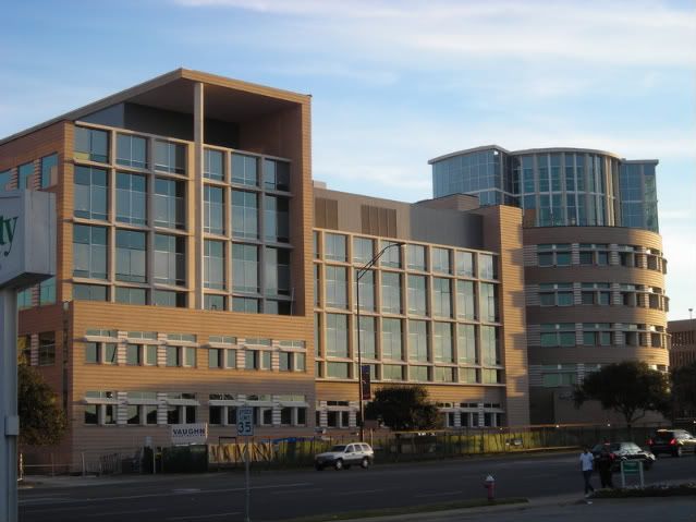
Now, on to the topic of the day - fabulous cities all over the world- London, New York, Milan, etc- are littered with both gorgeous and heinous buildings. But how about the ones you pass by every single day. This one is currenlty nearing completion on my very campus. I cringe every time I see it b/c honestly, it just makes no sense.

Im sorry, but this building is just odd, and I think it has to do with the details (some which you can't see.) The heavy duty cast concrete sun shades above the windows on the left and right wings of the building are awkward and I doubt they are long enough to actually block any kind of sun. Also, what's up w/ the two story tall wall/roof awning deal on the left wing of the building? It seems as unnecessary as the lonely 6 story column thats only there to support this weird canopy.
The funniest part - The brick was ordered in the wrong color (or at least the color they thought it was supposed to be appeared great in a small 3inx 8in form, not the case when its a sea of that color). So this building is a fabulous burnt orangey color, which is the color of our rival university and detested by all students here.
Ill give the building one thing - it blocks the view from the street of the existing Physics building, a 1970s/80s beauty of a bstructure - perfect for Soviet Russia or Communist China:

http://www.houstonarchitecture.info/
Just look at all that concrete! so warm and inviting!
Personally I think Michael Graves (whose studio designed the new building) should stick to designing toasters and laundry hampers for Target.
Floral Candy

These flowers are the only appearance of pink in the wedding scheme (thats why its called an accent). Wrapped with a simple navy ribbon for me (lime for my b-maids) and we're good to go. J'adore!
